Why the Color of Numbers and Lines Matters More Than You Think
When people think about paint-by-number design, they usually focus on the image itself or the paint colors. Very few ever consider the color of the numbers and lines printed on the canvas. But after spending the better part of a year testing materials and refining our process, I’ve learned that this small detail has an outsized impact on both the painting experience and the finished result.
Like everything else at Mitten Masterpiece, the colors we use for numbers and linework weren’t chosen quickly—or arbitrarily. They were tested extensively, evaluated on real canvases, and refined based on how they actually behave once paint is applied.
The Challenge With Lines and Numbers
Lines and numbers serve two different purposes, which means they shouldn’t necessarily be treated the same way.
Lines need to clearly define shapes and boundaries so painters always know where one area ends and another begins.
Numbers need to be readable while painting, but disappear completely once the area is filled in.
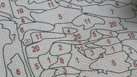
Early on, I tested a wide range of options—black, multiple shades of gray, and different reds—using them interchangeably for both lines and numbers. What quickly became clear is that no single color works equally well for both functions.
Why Dark Lines Still Matter
For linework, clarity is essential. Lines that are too light can disappear visually, especially in complex or detailed sections, making it harder to confidently identify shapes.
After testing black, charcoal, and lighter grays, I landed on a dark gray for our linework. It provides strong shape definition without the harshness of pure black. Dark gray lines remain easy to follow while painting, yet feel softer and more refined once the artwork is complete.
Just as importantly, dark gray lines don’t overpower the design the way heavy black outlines can. They support the structure of the painting without drawing attention to themselves.
Why Numbers Work Best in a Soft Red
Numbers, on the other hand, benefit from a different approach.
Through extensive testing, I found that a soft, muted red consistently performs best for numbering. Red naturally stands apart from most paint colors, making numbers easy to locate while painting. At the same time, when chosen carefully, a soft red covers cleanly—even under lighter colors like whites, creams, and yellows.
Unlike black or dark gray numbers, soft red numbers are far less likely to ghost through the finished paint. They do their job while you’re painting, then disappear when they’re supposed to.
Our Preference
Red numbers with dark lines.
The Balance Between Visibility and Coverage
This combination—dark gray lines and soft red numbers—creates the best overall experience.
Shapes remain clearly defined
Numbers are easy to identify without strain
Light paint colors stay clean and luminous
The finished artwork feels painterly, not technical
When numbers and lines fade appropriately beneath the paint, the canvas stops announcing itself as a paint-by-number piece. What remains is the artwork itself.
Why This Detail Matters for Wall-Worthy Results
Small details often make the biggest difference in whether a finished piece feels display-ready. Bold numbers or overly dark outlines can subtly undermine an otherwise beautiful painting.
By separating the roles of lines and numbers—and choosing colors that serve each purpose intentionally—we’re able to support both the process and the final presentation.
It’s a detail most people never notice consciously. But they feel it in how smoothly painting goes, and they see it in how polished the finished piece looks on the wall.
Tested, Refined, and Chosen on Purpose
At Mitten Masterpiece, we test things most people never think about because they shape the entire experience. Choosing dark gray for linework and soft red for numbers wasn’t a stylistic preference—it was the result of months of real-world testing.
When those elements work quietly in the background, painting feels easier, cleaner, and more satisfying. And that’s exactly how it should feel.
❤️ With Love from Michigan,
Bobbie