Understanding Opacity and Lightfastness in Acrylic Paints (and Why a Second Coat Isn’t a Failure)
One of the most common questions I see from paint-by-number painters is some version of this: Why does this color need a second coat? The assumption is often that needing another layer means something is wrong with the paint.
In reality, it usually means the opposite—it means the paint is behaving exactly as it was designed to.
To understand why, it helps to know two important concepts that apply to all acrylic paints, from entry-level craft paints to the most premium artist-grade formulas: opacity and lightfastness.
What Opacity Actually Means
Opacity refers to how much light passes through a paint layer and how completely it covers what’s underneath. Some pigments are naturally opaque, while others are inherently transparent or semi-transparent. This isn’t a flaw—it’s a property of the pigment itself.
For example:
Earth tones and whites tend to be more opaque
Many reds, blues, and yellows are naturally more transparent
Bright, saturated colors often trade opacity for vibrancy
Even the most premium acrylic paints follow these rules of chemistry. A transparent pigment will still be transparent, no matter how high the quality.
That means some colors—by design—may need a second coat to fully cover printed numbers or underlying lines. This is normal, expected, and part of working with professional-quality materials.
Why Better Paint Doesn’t Mean “One Coat Always”
High-quality acrylic paints prioritize pigment integrity. Instead of loading paint with fillers to force opacity, premium brands allow pigments to behave naturally. This preserves color clarity, richness, and long-term stability.
Cheaper craft paints often achieve quick opacity by adding chalky fillers or excess binders. While this can make a paint look opaque right away, it often results in:
Duller color once dry
Weaker adhesion
Poor long-term durability
So while a low-cost paint may appear to cover in one pass, that coverage can come at the expense of vibrancy and longevity.
With better paints, a second coat isn’t a correction—it’s a refinement.
The Role of Lightfastness
Lightfastness refers to how well a pigment resists fading over time when exposed to light. This is especially important for artwork meant to be displayed.
Highly lightfast pigments are more stable, but they’re often more transparent by nature. Paint manufacturers prioritize longevity over forced opacity because a color that stays true for decades is more valuable than one that covers instantly but fades.
This is one of the reasons professional artists—and premium paint-by-number brands—accept that some colors benefit from layering.
Why Premium Paint Still Performs Better
Even when a second coat is needed, higher-quality paints still outperform craft and student-grade options in meaningful ways.
Better paints:
Cover more evenly
Maintain color accuracy
Don’t become muddy when layered
Glide smoothly over the canvas
Retain vibrancy once dry
A second coat with a premium acrylic is usually quick and controlled, not frustrating. The paint behaves predictably, allowing you to refine edges and deepen color without fighting the surface.
By contrast, craft paints and many student-grade paints often require multiple corrective layers just to achieve basic consistency.
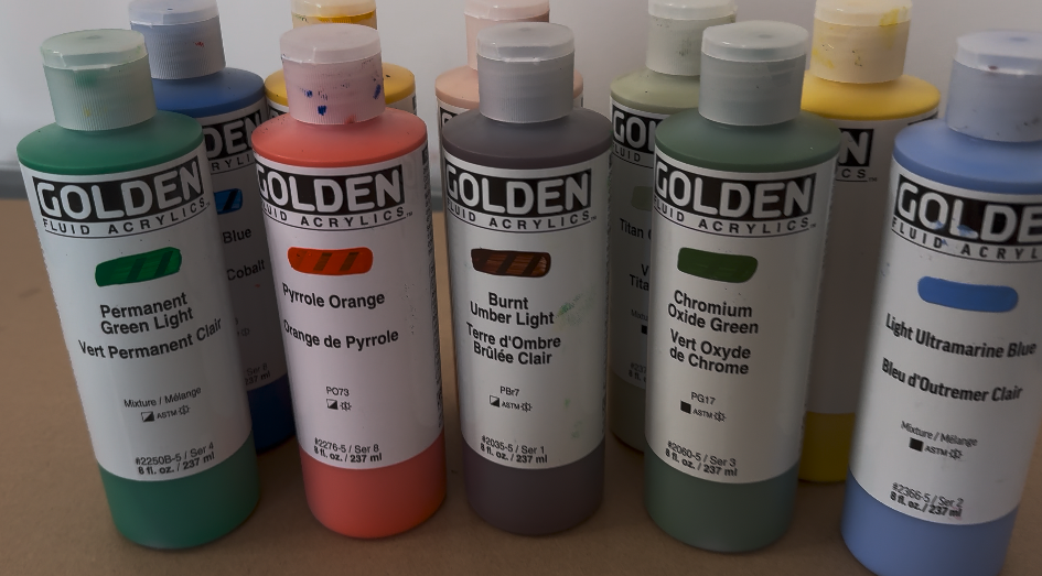
Our Go-To: Golden Fluid Acrylics
What This Means for Paint-by-Number Painters
Needing a second coat doesn’t mean you’re doing something wrong—and it doesn’t mean the paint is low quality. In many cases, it means you’re working with pigments that are designed for clarity, depth, and longevity.
Paint by number is meant to be relaxing, not rushed. Layering gives you time to slow down, enjoy the process, and watch the artwork develop naturally. It’s part of what turns a simple activity into something more painterly and intentional.
How We Think About This at Mitten Masterpiece
When we choose and mix paints for our kits, we factor opacity and lightfastness into every palette. We design color sets so that they work harmoniously, knowing that some shades will naturally be more transparent than others.
Rather than masking this reality, we embrace it—because it leads to richer color, better blending, and finished artwork that holds up beautifully over time.
Our goal isn’t to eliminate nuance. It’s to support a painting experience that feels professional, forgiving, and rewarding.
A Better Way to Think About Coverage
Instead of asking whether a paint should cover in one coat, it’s more helpful to ask:
Does it behave consistently?
Does it stay vibrant when dry?
Does it layer cleanly without dulling?
Will it still look good years from now?
When the answer to those questions is yes, an extra brushstroke or two becomes part of the craft—not a compromise.
Paint by number, at its best, isn’t about speed. It’s about creating something you’re proud to hang on the wall—and understanding your materials is part of that journey.
❤️ With Love from Michigan,
Bobbie